Breaking Down Exceptional Ads: Why They Work and How to Steal Their Magic

Breaking Down Exceptional Ads: Why They Work and How to Steal Their Magic
Every exceptional ad leaves a mark — but not by accident. Behind each one is a smart, deliberate reason why it works. Maybe it hits a raw emotion. Maybe it shows up at the perfect moment. Maybe it’s just bold enough to be unforgettable.
In this post, we break down the real reasons behind ads that actually get remembered and shared — backed by sharp examples you can steal from, study, or just admire.
Great ads make one clear point — and make it loud. No clutter, no list of features. Just one sharp hook that sticks — the one thing you want them to remember.
Example: Loctite’s “Fixes Everything” – Royal Family ad
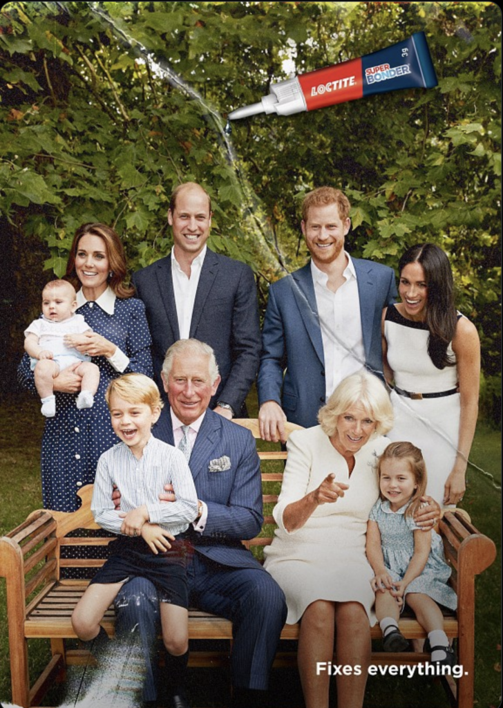
Why it works: The whole ad revolves around one sharp metaphor — glue strong enough to fix even a royal breakup.
The ad makes you feel something — laughter, urgency, joy, pain, desire, even awkwardness. If you don’t feel it, you won’t remember it. Great ads don’t just sell features — they sell a feeling.
Example: “Raid Ad – Unexpected Power”
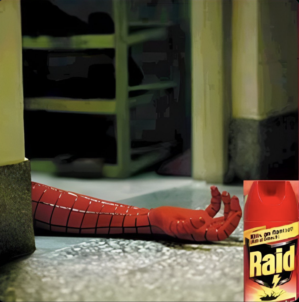
Why it works: It delivers instant shock and dark humor. Seeing an iconic “superhero” lifelessly sprawled on the floor hits you with surprise and a smile — making you instantly grasp how powerful the product must be.
The ad connects to what’s happening right now in culture, news, or the audience’s life. When the timing is right, the message hits harder.
Best Example: WWF Ad — “Protect Our Wildlife, Before It’s Too Late”
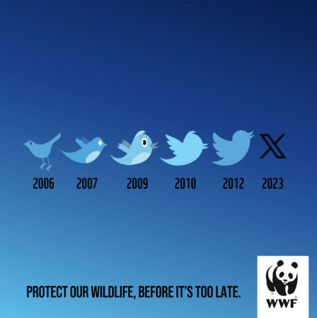
Why it works: It hijacks the evolution of the Twitter bird into “X” to deliver a powerful message about extinction — perfectly timed to launch right as Twitter rebranded in 2023.
The ad interrupts what people expect to see — visually, tonally, or conceptually.
It doesn’t look like a typical ad. Instead, it surprises, feels raw, or even calls itself out. That’s what makes it feel clever, bold, or impossible to scroll past.
Best Example: Billboard Ad — “We Are Looking for Graphic Designer” (MS Paint style)
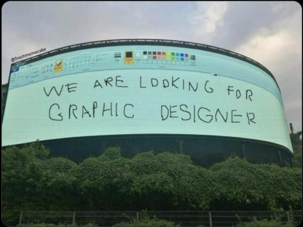
Why it works: It looks bad on purpose — breaking every design rule to make a joke that is the message. The visual is so unexpected, it grabs attention instantly and makes the point perfectly.
The message is instantly clear — no fluff, no overthinking. The headline hits, the visual reinforces it, and the meaning clicks in seconds. Clean layout, bold text, and tight copy create zero friction, just instant understanding.
Best Example: Nike Ad — “Yesterday You Said Tomorrow”
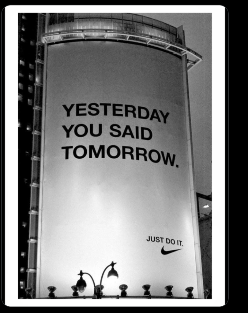
Why it works: Four words. Black text. White wall. You instantly get the message — and feel the pressure. It’s brutally clear and impossible to misinterpret. That’s magnetic clarity in action.
The ad taps into something the audience deeply relates to — their habits, struggles, humor, or worldview. It might use their language, reflect their daily reality, or nail an inside joke. When it hits, it feels personal — like it was made just for them. Result: Instant connection and trust.
Best Example: Headspace Ad – “The Everyday App for January”
Why it works: It nails the real, unfiltered truth of January — when people feel overwhelmed, burnt out, and tired of overpromising to themselves. Instead of selling transformation, it gently offers support, calm, and realism. It feels like: “Finally, someone gets how I actually feel.”
The ad idea is so visually or conceptually distinct, it sticks in your mind immediately.
You remember it. You talk about it. That’s power. Whether it’s strange, clever, or beautifully simple, it sticks — and that’s what makes it unforgettable.
Best Example: Highway Rest Stop Ad — Tunnel as a Mouth
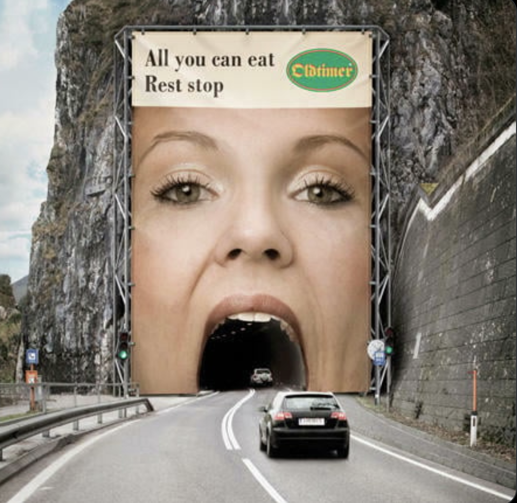
Why it works: It transforms a plain rest stop into a playful human face using the tunnel as a mouth — a bold, simple idea that’s instantly memorable. It grabs your attention, makes you smile, and it’s the kind of visual you’ll tell friends about later — and actually stop to eat at, just to be part of the joke.
The 7 principles above are what make an ad exceptional at the awareness stage — they grab attention, spark emotion, and make people think “This speaks to me — and I get it instantly.”
But if you want someone to go further — click your ad, sign up, or buy — you’ll need two more traits:
• Credibility (clear, specific proof they can trust)
• Call to Action (a confident, low-friction next step)
For that, we built a simplified 3-part framework built specifically for performance ads.
See the full guide to Performance Ads That Sell here.
Not every exceptional ad needs to hit all 7 elements — but the best ones usually nail 2 to 4 of them extremely well. The right mix depends on the format (billboard vs. video), channel (email vs. YouTube), goal (brand awareness vs. conversion), and where the audience is in their journey (awareness, consideration, or decision).
Some ads win with clarity and timing. Others break patterns while tapping into emotional truth. The real magic happens when multiple elements work together — reinforcing the core idea from different angles.
For example:
The WWF Twitter/X ad combines:

✅ Emotional Trigger
✅ Timely Relevance
✅ Magnetic Clarity
Headspace spot might blend:

✅ Customer Truth
✅ Emotional Trigger
✅ Pattern Break
✅ Magnetic Clarity
Loved the story? Share it to inspire others and spark new ideas!

 LinkedIn
 Twitter (X)
 Facebook
 Copy link


